2023 Wedding Trend: Color
Welcoming color into your wedding
Have you heard????? The Patone Color os the Year is “Viva Magenta”!!!!
Per Pantone, Viva Magenta was chosen because…
“This year’s Color of the Year is powerful and empowering. It is a new animated red that revels in pure joy, encouraging experimentation and self-expression without restraint, an electrifying, and a boundaryless shade that is manifesting as a stand-out statement. PANTONE 18-1750 Viva Magenta welcomes anyone and everyone with the same verve for life and rebellious spirit. It is a color that is audacious, full of wit and inclusive of all.”

Okay, maybe you’re a little bit like me, and are kinda new to the study of color theory, and aren’t well versed in how color can impact our daily lives. However, as a result of this lack of knowledge, I did pick up a book about the science behind color, and it was actually quiet fascinating to learn about how color is a perception, and not so much a matter of fact. What an interesting concept to think that our brains are constructing (and perhaps occasionally prohibiting) this phenomena that we have been taught our entire lives is so veracious.
In the book, the authors, an interior designer and entrepreneur, ask the question; “How many colors can humans see?”, and comes to the following conclusion:
“Those of us with normal color vision can potentially see millions of colors. The actual number depends on the person, and the context. We can see the most differences in colors when they are laid out sequentially in front of us. But flash them one at a time, and it would be hard to tell the difference between dozens, hundreds, thousands, tend of thousands, hundreds of thousands, and potentially millions of colors. Of course every person is different and some are more sensitive to, and this able to perceive, more colors and changes in color. Just as some people have perfect pitch, some people have an equivalent ability with color and can identify tiny changes from one color to the next that others cannot.”
This explains why there is an age old argument about having several different pairs of “fill in the blank wardrobe items” that appear to all the the same to your partner.
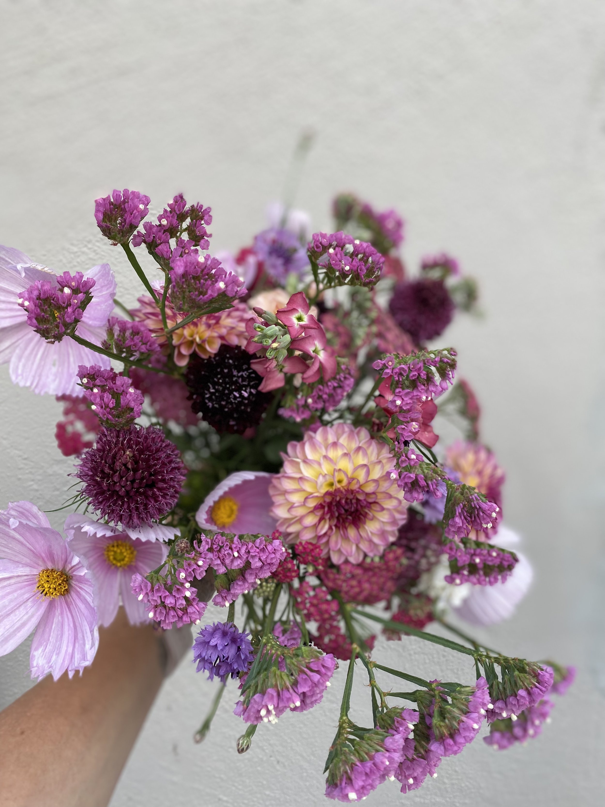
How many pinks and/or purples do you see?
Now, as a floral designer, I LOVE color!!! I love combining, and matching color. I love using color to convey a feeling or sentiment.
I love the way that yellow brightens gloom as the seasons change from winter to spring.

I love how summer brights can scream, “there’s a party going on over here! Come and join us!”

I love how the light softens in the fall, bringing out rich and saturated tones. I often take simple pleasure when I design something, and think, “wow, now that is stunning because of the color!” Yes, I definitely bring texture and depth into my work, but sometimes, it’s simply the color that swoons me.

So how does one start using Viva Magenta in their wedding?
Start with the base. The amaranth and mums represent shades of Viva Magenta.

Bring in the compliment (this can sometimes surprise you). The purple statice, and cosmos add a nice compliment without being too glaring.

And then add the pop! Brining in more shades of magenta, reds, rusts, and even the in-your-face orange of the marigolds.

Voilà!!!! You have a palette that can be used based off Viva Magenta!!!
Of course, there are several different directions one can go with Viva Magenta, but for the local flower lover, be sure to consider what is seasonally appropriate (and available).